Neura
Industry
Lifestyle
Service
App Design
Date
August 2024
Neura is the result of a collaborative effort between five UX/UI designers, all working together to create an intuitive and seamless solution for managing smart homes. Our goal was to develop an app that not only simplifies the process of controlling smart devices but also elevates the user experience by making it smarter and more personalized.
Introducing Neura, the app that empowers you to take full control of your smart home. At the heart of Neura is Alara, our AI-powered assistant who is always on hand to help you set the perfect ambiance in your home. Whether you need to dim the lights, adjust the temperature, or play your favourite playlist, Alara is there to streamline your commands and make managing your smart home effortless.
Neura also offers custom pre-sets tailored to your daily routines. From waking up in the morning to winding down at night, our pre-sets ensure your home is always set to the most optimized conditions, saving you time and energy while enhancing your comfort.
One of the standout features of Neura is its mood recognition mode, which uses facial scanning technology to detect your emotions and adjust your home’s settings accordingly. Whether you're feeling energized, relaxed, or in need of focus, Neura’s mood recognition adapts your smart devices to complement your current state, creating a truly personalized environment.
With Neura, controlling your smart home becomes not just convenient, but a truly tailored and immersive experience.
PROBLEM STATEMENT:
Homeowners need an intuitive control interface in order to maximise convenience and simplify home automation
As a team, we dedicated significant time and effort to conducting thorough research during the first phase of this project. Our approach involved multiple research methods to ensure we had a well-rounded understanding of the target market and user needs. We began with desk research, diving into industry trends, existing smart home solutions, and emerging technologies to build a foundation of knowledge. This was followed by a detailed competitive analysis, where we assessed key competitors in the market, identifying their strengths and weaknesses, and uncovering opportunities for Neura to differentiate itself.
To further inform our design decisions, we conducted surveys with a large and diverse group of potential users. These surveys helped us gain direct insights into the challenges and preferences that people encounter when using smart home devices. By combining qualitative feedback with quantitative data, we were able to identify patterns in user behaviour and expectations, which ultimately shaped the features and functionality of our app.
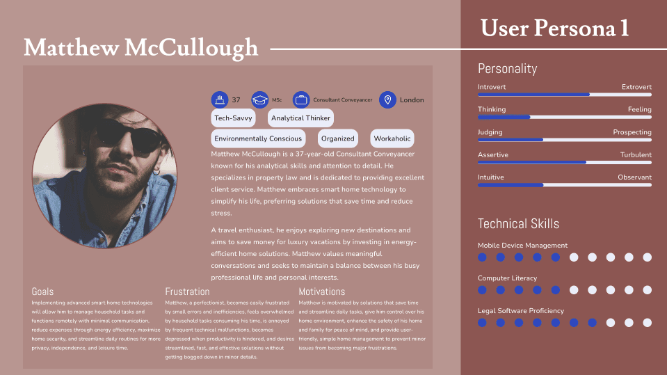
This wealth of information was then distilled into two key User Personas: Matthew McCullough and Amber Thompson. Matthew represents the tech-savvy user who values convenience and efficiency in managing his smart home, while Amber embodies the user who seeks simplicity and a more intuitive, user-friendly interface. These personas guided our design process, ensuring that we addressed the needs of a wide range of users and created a product that resonated with different types of smart home enthusiasts.
Once we had developed our user personas, we moved into the ideation phase, where we began brainstorming potential solutions. Our team engaged in multiple collaborative brainstorming sessions, encouraging creative thinking and the exploration of a wide range of ideas. We carefully considered various ways to address the needs and pain points identified through our research. After evaluating several concepts, we collectively agreed that a mobile app would be the best solution to help users take control of their smart homes in a more intuitive and personalized way.
With the app idea in place, we began developing detailed user flows to map out how users would interact with Neura. These flows helped us visualize the step-by-step journey a user would take, from setting up the app to using its core features. This exercise was crucial in identifying potential friction points and ensuring the design was as seamless and user-friendly as possible.
Once we had clear user flows, we moved on to creating paper prototypes, allowing us to quickly sketch out and test the app's layout and functionality. These low-fidelity prototypes gave us the freedom to experiment with different layouts and interaction patterns while staying focused on user needs. Through iterative testing and feedback, we refined these prototypes, which paved the way for the development of wireframes.
It was during the wireframing process that Neura truly started to take shape. The app’s core structure, navigation, and interface elements began to reflect the sleek, intuitive design we envisioned. These wireframes served as the blueprint for the app, allowing us to translate our initial ideas into a tangible product that was both functional and visually appealing—laying the foundation for the Neura we know today.
With the wireframes completed, we shifted our focus to developing the app’s visual style. This phase was crucial in bringing the app’s personality to life and ensuring it resonated with users on an emotional level. To begin, each team member created their own style tile, which included color palettes, typography options, and design elements they felt would best represent Neura. After reviewing all the tiles, we collectively decided to go with a vibrant bright yellow as the primary color for the app. This choice was made because yellow evokes a sense of warmth, energy, and positivity, making it an inviting and welcoming color for users as they interact with their smart home.
To further refine the app's visual direction, we collaborated on creating a moodboard to establish the overall tone and aesthetic for Neura. The moodboard featured a curated collection of images, textures, and design inspirations that embodied the experience we wanted to evoke—a balance of modern, high-tech innovation with a sense of warmth and approachability. This tool helped us align our vision and ensure that the app felt not only visually cohesive but also inviting and easy to use, laying the groundwork for the final design.
With the visual style clearly defined, we were ready to move on to the final mock-ups. These high-fidelity designs incorporated all the elements we had developed, from the bright colour scheme to the sleek interface, bringing the app’s vision to life. The mock-ups allowed us to see how the app would look and feel in real-world use, marking the final step in translating our design ideas into a polished, user-centered product.
We received a substantial amount of feedback on our app, with responses varying widely. Many users praised the design approach, highlighting how the aesthetic choices and user interface contributed to a positive and engaging experience. However, some feedback indicated that the color scheme might be a bit too bright for their preferences, suggesting that the vibrant hues could be overwhelming for extended use. This feedback was invaluable, as it highlighted the need for balance between visual appeal and user comfort.
From this experience, I have learned several key lessons:
Collaboration and Communication: Effective teamwork and open communication were crucial throughout the project. Coordinating with five UX/UI designers required regular discussions and a collaborative approach to ensure everyone’s ideas were integrated and aligned with our goals.
Team Roles and Contributions: Understanding and appreciating each team member’s role and contributions were essential. Each designer brought unique skills and perspectives, and recognizing these strengths helped us achieve a well-rounded and cohesive design.
User-Centered Design from Multiple Perspectives: Finally, I learned the importance of user-centered design from various perspectives. Incorporating feedback from different users helped us understand diverse needs and preferences, reinforcing the need to design with empathy and adaptability.
These insights have been instrumental in shaping my approach to future projects, emphasizing the value of collaboration, clear communication, and a user-focused mindset.


